I'm Marc.
I am a product / UX designer with a restless curious mind. With over 8 years of work experience, I have profound expertise in managing human-centered product development. Founding my own brand has allowed me to gain experience in all product design and development stages as well as business and leadership. My goal is to deliver real value to people and generate sustainable results. I am very analytical, hands-on and energetic, with a strong entrepreneurial mindset. Understanding, being creative, and having a diverse toolbox in place is my recipe to synthesize new ideas. I believe in the value of bold strategies, open learning processes, and sustainable design solutions.
project space
please select a project or scroll down.
project space
please select a project or scroll down.
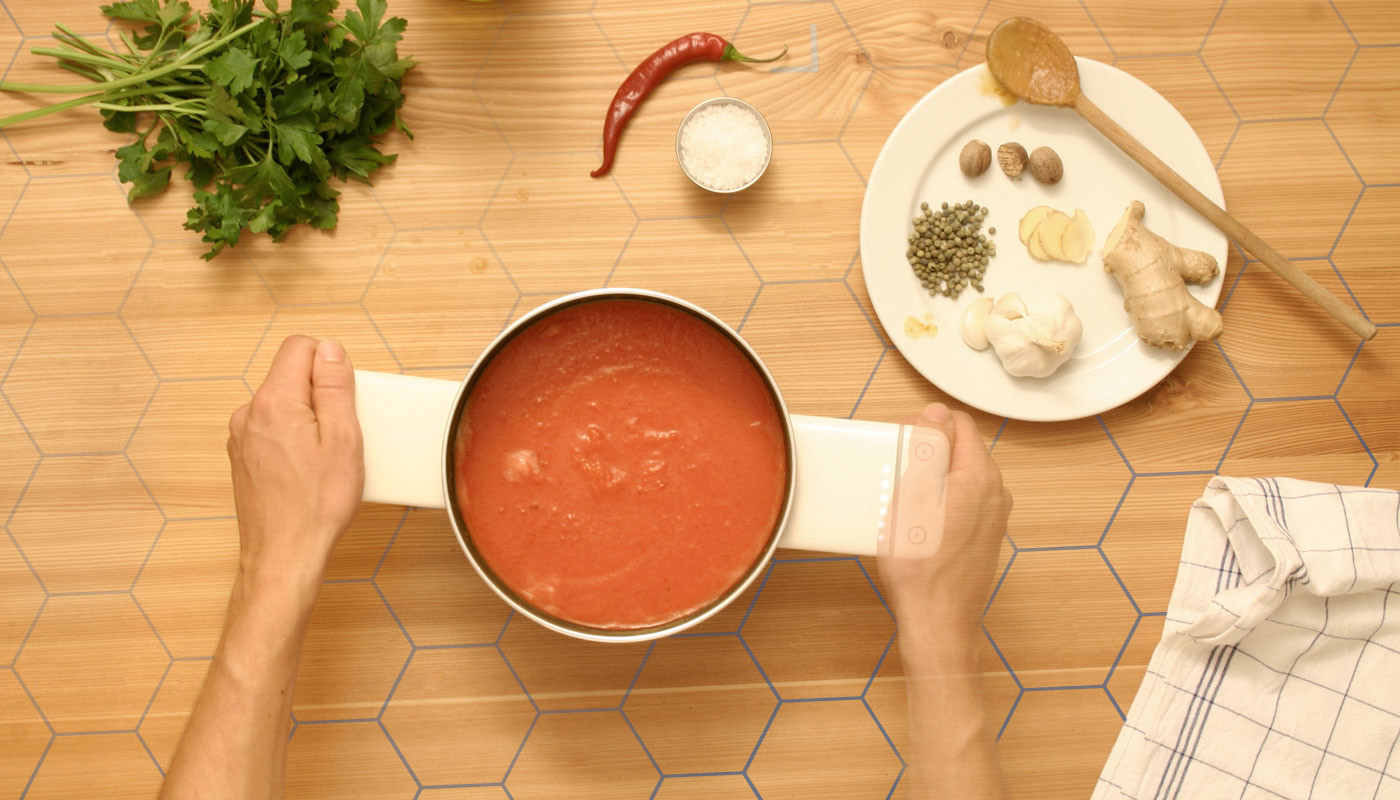
Redline stove.
the most simple cooking interaction.
2012-2016

1. Historicly we used fire as a head source, controling the temperature by moving the dish.

2. Industrialisation let to individualy controlled head sources, using a variation of buttons, nubs, touch controlls ect.

3. using modern induction technology, transferig the ancient method of moving the dish toward and away from the "fire" introduces new habits in the kitchen, which feel completely natural and will be the future of cooking.
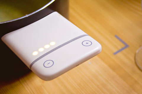
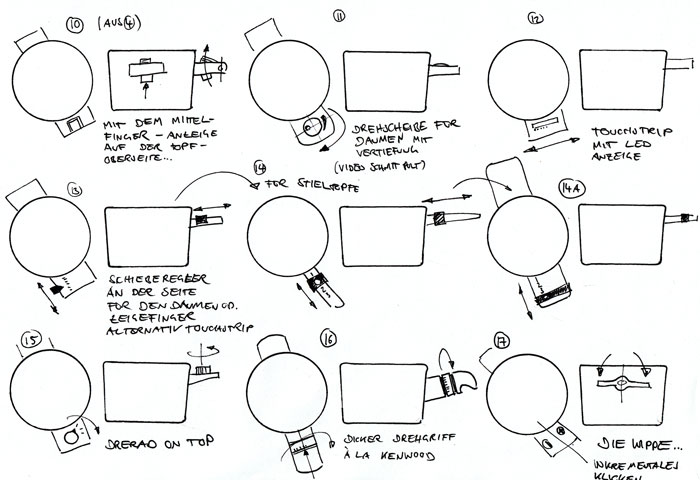
The (red) line is the only indication on the surface of the stove. It indicates the two things. 1. Where one can activate the stove and 2. the zone of the highest cooking power. Pulling the pod/pan towards the user will gradually decrease the heat. simple.


co-design workshop & UX concept
Weizenbaum-institut
2021-2022
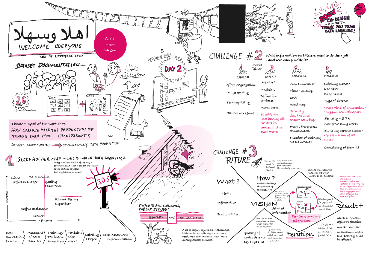
This workshop is part of a research project from various scientists. The last chapter consisted of two co-design workshops in which the institute invited me to co-organize and co-facilitate the workshop. it gathered AI data labelers to design a documentation framework for machine learning datasets. Apart from the primary research paper, I took the insights from the workshops and the paper to design a platform that reflects the results in an actual product. On the right, you find my mock-up for an app that will involve and help data labelers contribute to the transparency of Ai products by documenting their work.

brand | product | web design
2013-2019
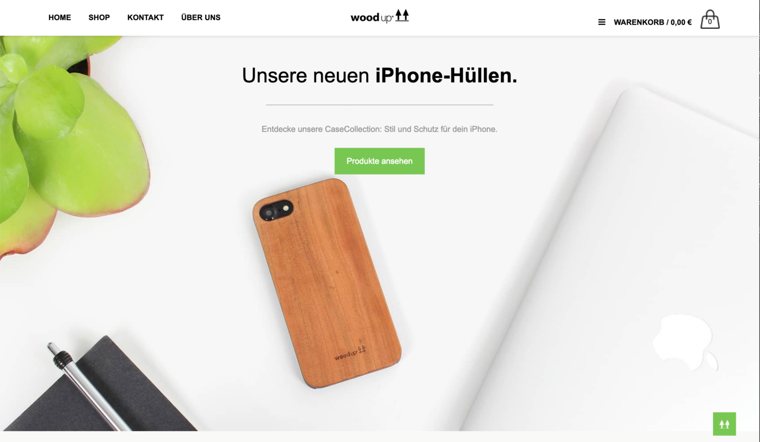
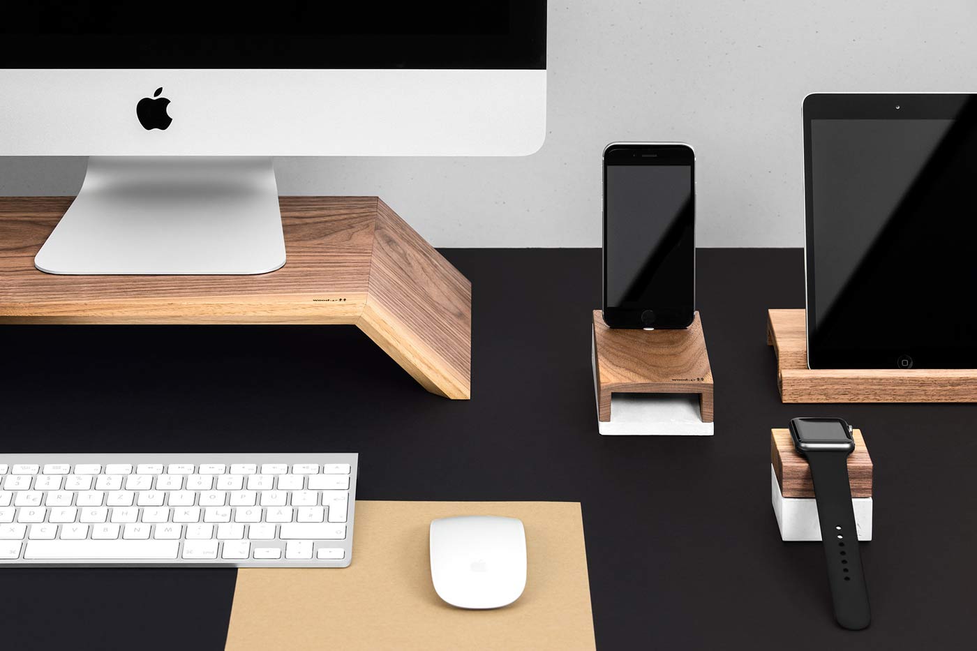
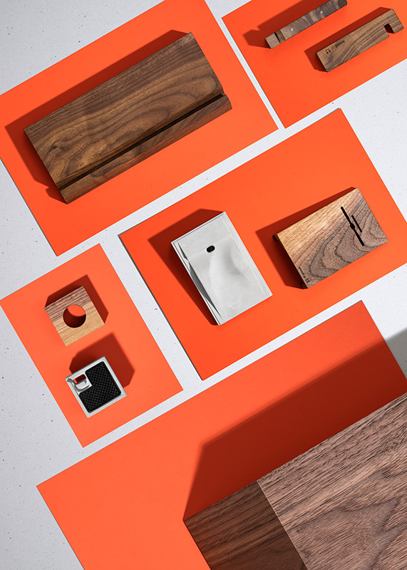
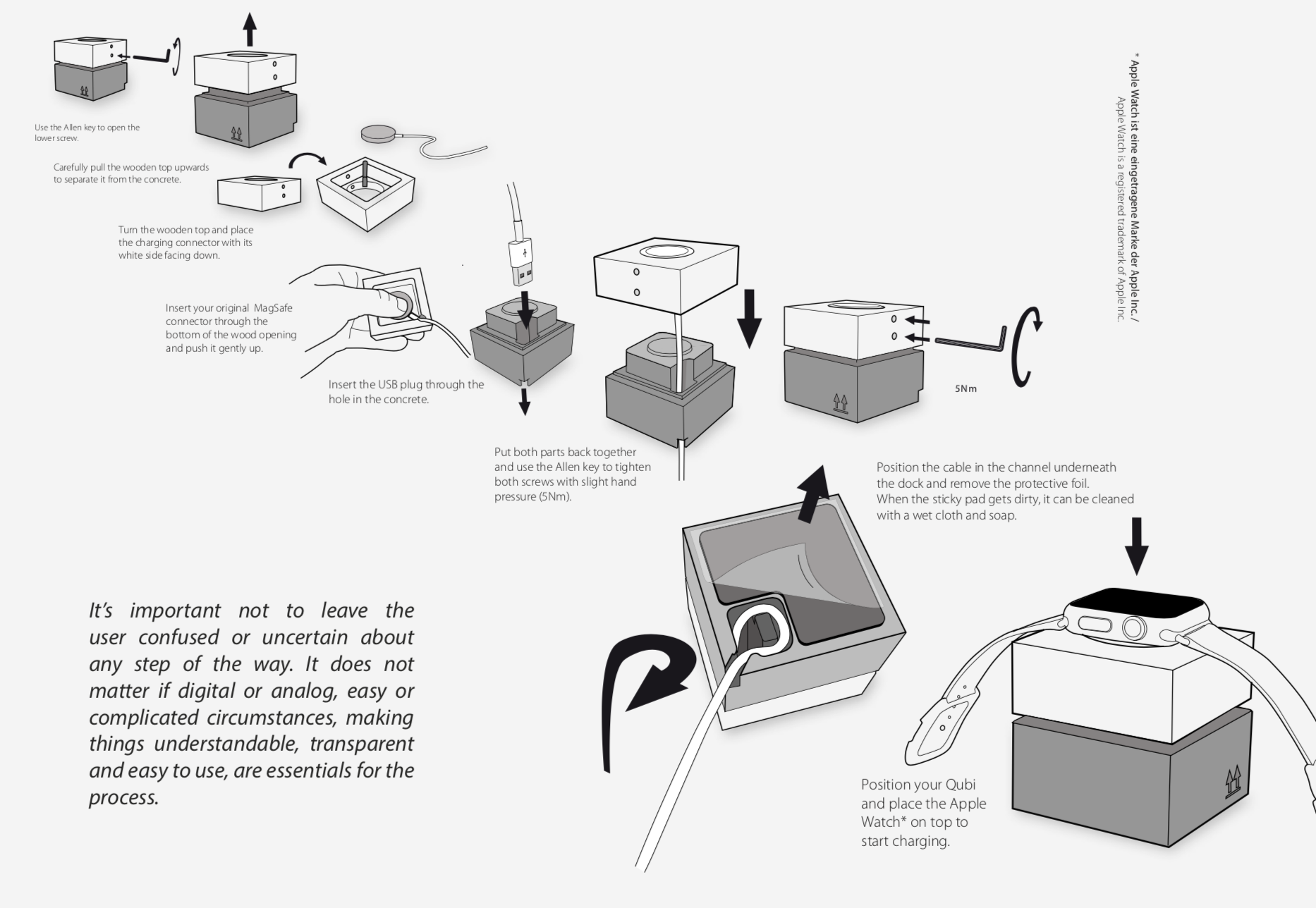
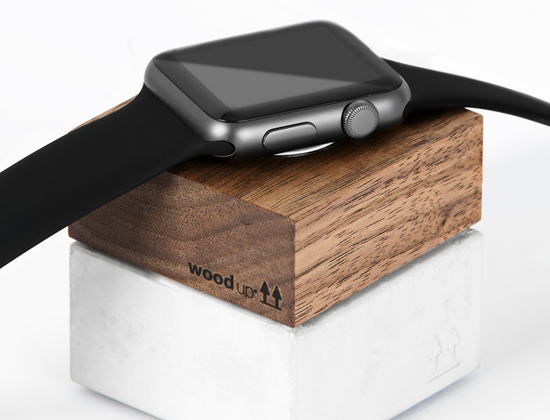
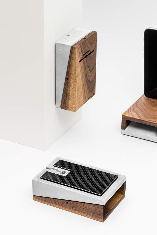
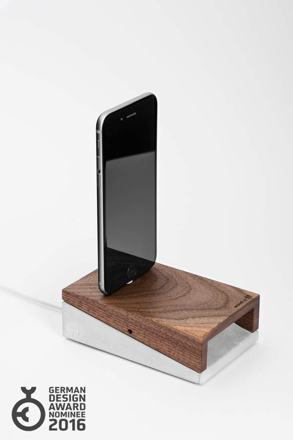
A vague idea, that a wooden iPad stand could make a difference, started this project. I remember enjoying the wooden silhouette of a prototype I made in a friend’s workshop. My fascination for traditional work techniques with a puristic design approach made WoodUp kick off automatically. One thing let to the another, WoodUp was growing in every direction: more products, packaging, online store, infrastructure, logistics, productions, employees, marketing, and so much more!
design process & research
Colunch
Meet interesting, maybe very different people during your lunch break.
2012
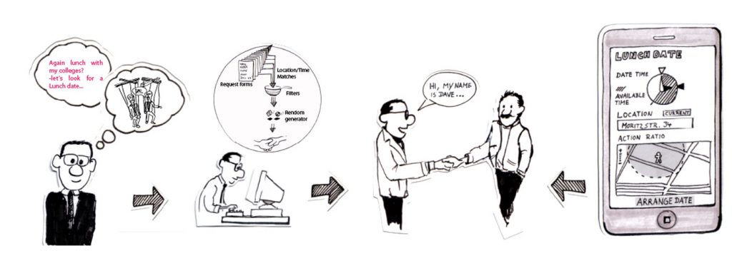
CoLunch is a platform that opens a perspective for a lunch break far away from the usual habits and places: fast and uncomplicated, you can find interesting people to have lunch with. The lunch partners are randomly selected in your area and in your self defined time and expense limit. The platform is not meant to be a find-love-website, but a brilliant medium to experience a different lunch break and get inspired by new people.
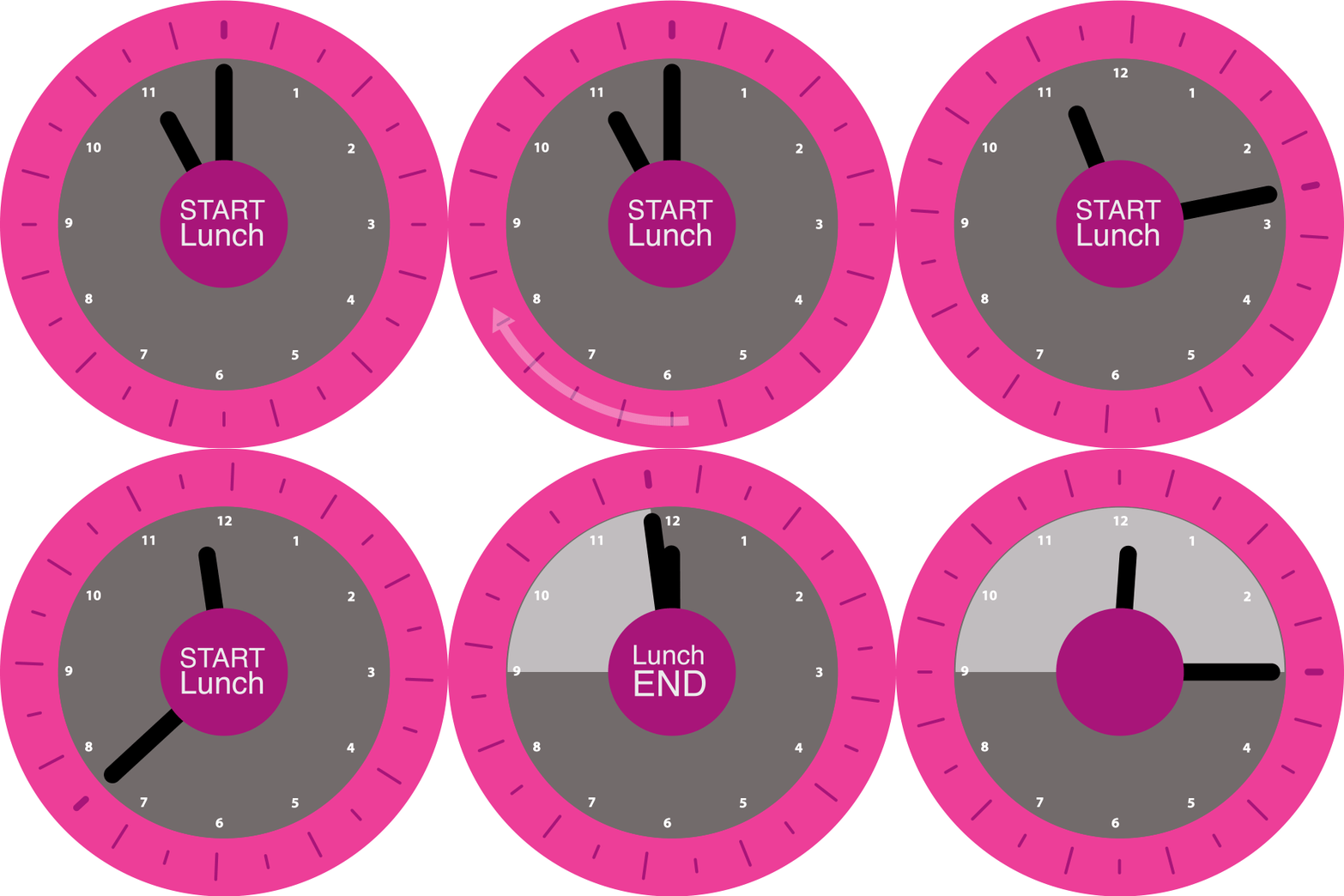

LUNCH TIME
It is hard to escape work – even during lunch time. Having lunch every day with the same people you work with? WHY NOT GOING OUTSIDE TO LOOK FOR SOME NEW INPUT? New ideas and perspectives are not encourage by constant interaction with the same group, but rather by unexpected encounters.
CONVERSATION
The platform has the goal of generating conversations through all layers and topics of society. By not knowing whom you are meeting, users do not have prejudices or barriers and are open to unexpected experiences.
App
If you are on the run, a business trip or just like to use new tools, an app can send out a request fast and uncomplicated. You just need to decide at what time, for how long and where you would like to meet somebody.
Interface prototype
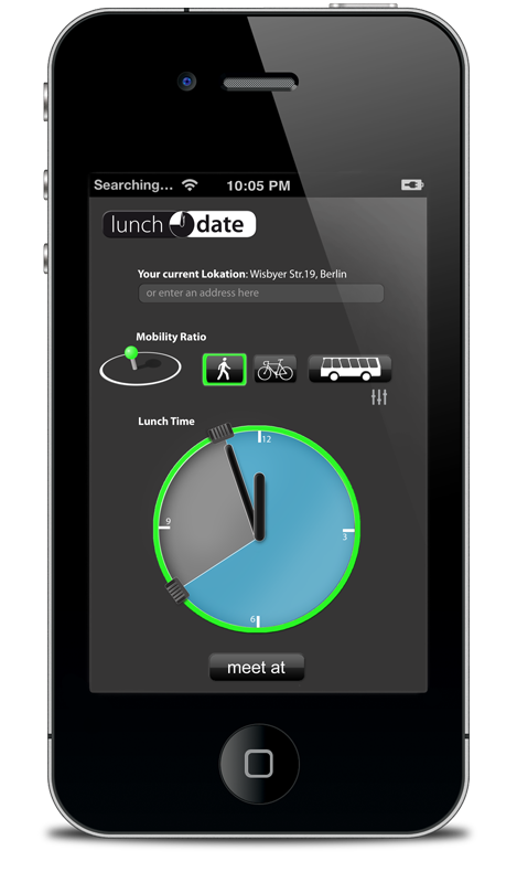
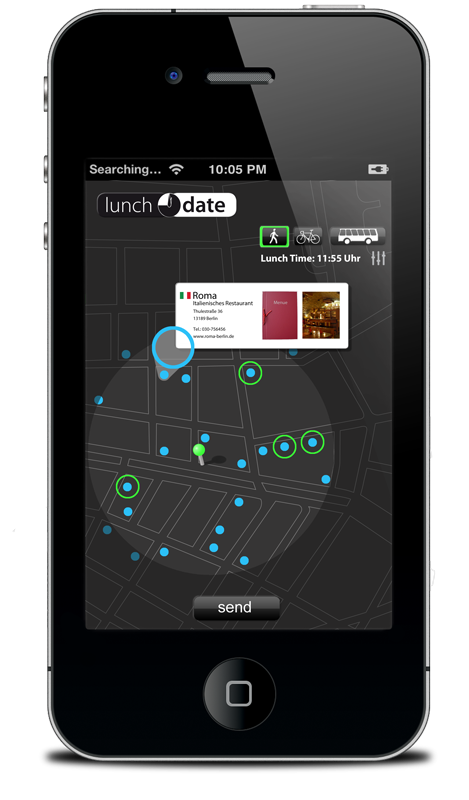
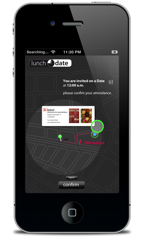
HPI Venture Business Plan Competition, third round 2012 with Felix Schwarz (Programmer) and Mila Miceli (Communication/Sociology)
school of senses
what is media – in a kindergarten Environment?
2011
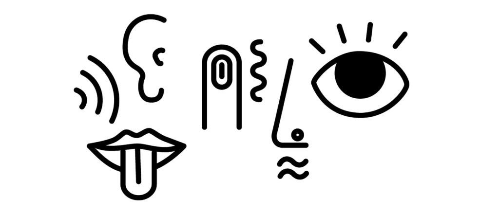
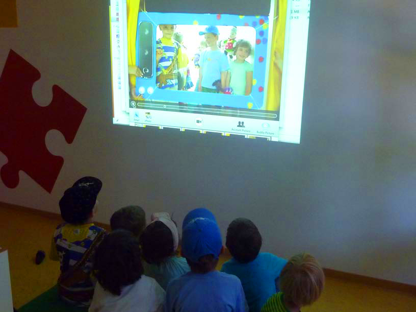
The project challenge was to design a media room for a kindergarten. Entering the project the main target group, the children, were mostly supervised by the adults view on how they wish there children to be in the future. The team explored, what is media and what means media to the three different influencing groups: parents, experts and the children. We played, crafted and experimented with kids in the age group from 3 to 6 years, before creating the School of Senses, which is built upon the principals of:
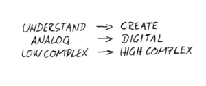
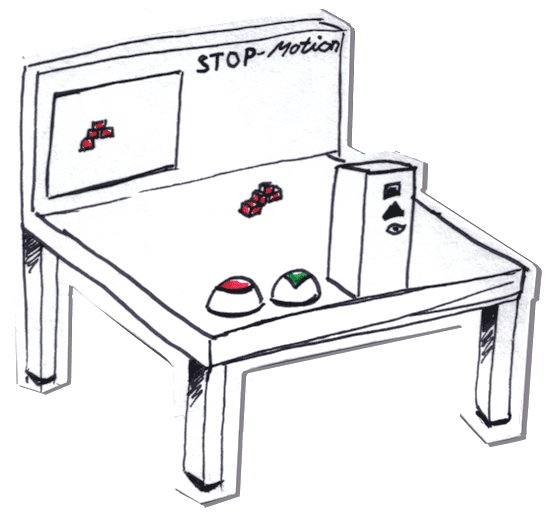
The principal idea is to have a flexible toolbox of topics for children to explore. For each field, we created different evolution steps. For example in the Movie field, the way goes from crafting flip books, over exploring an stopmotion stage, towards beeing on a real stage. This learning process does not need to be linear. Children experience new possibilities and are free to transform them in their own ideas.
Example project "running pictures"
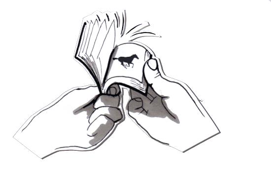
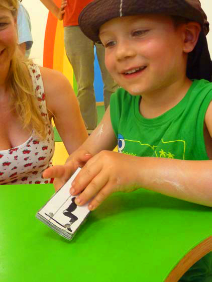
1. THE FLIP BOOK
How do pictures learn to walk? Kids naturally express themselves by drawing. A series of drawings yet is too complex to imagine but it makes sense immediately as they put it together.
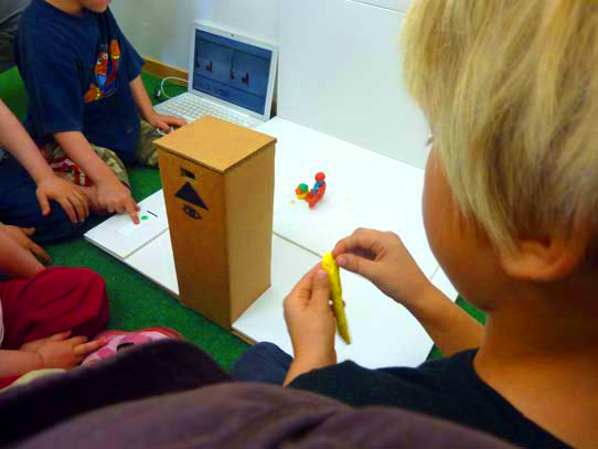
2. THE STOPMOTION STAGE
By using simple objects such as Lego or clay, which can be moved around and step by step be recorded, kids start to form a movie with a simple setup.
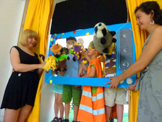
3. THE real STAGE
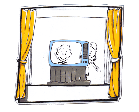
A social place of live experience. A variety of opportunities, such as the paper television, the shadow curtain, the role play, or the first movie, provide a fun group experience and give kids the chance to dive into their fantasy world.
Fröbel Gruppe » 04/ 2011- 06/2011 | A Media Room for the Kindergarten | Marc Pohl, Eva-Maria Zoll, Jan-Felix Schwarz, Luise Vörkel, Gergana Karadzhova, Julia Butter.
Kompass
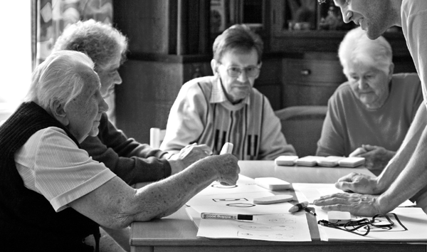
orientation for people with dementia
2008

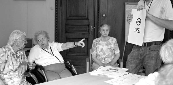
What if? There are so many possiblilties what could happen to the person we are taking care of!
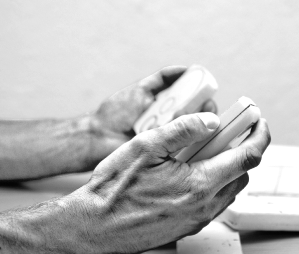
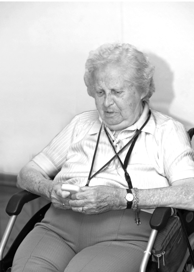
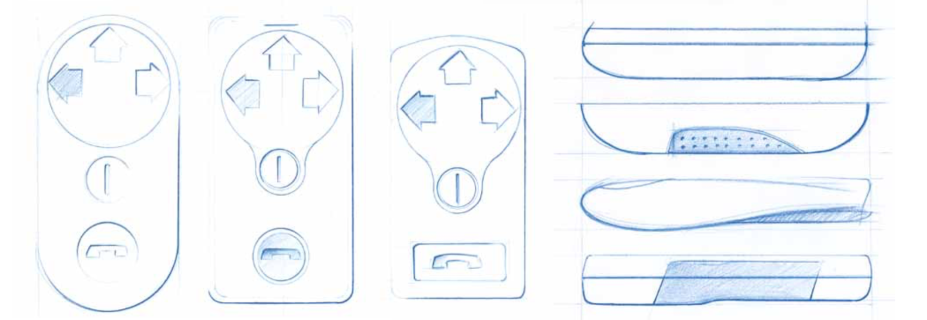
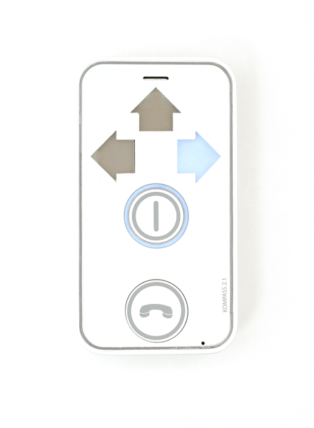
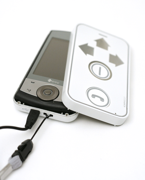
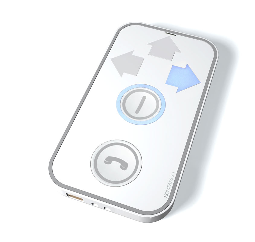
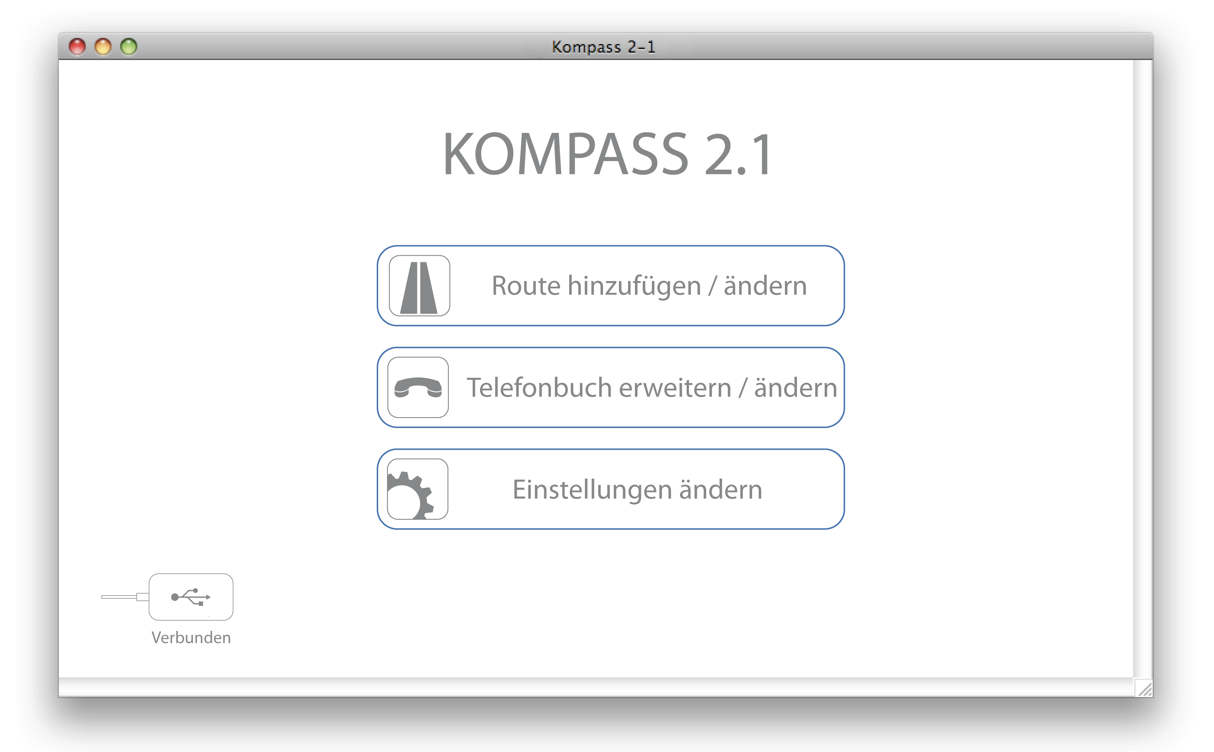
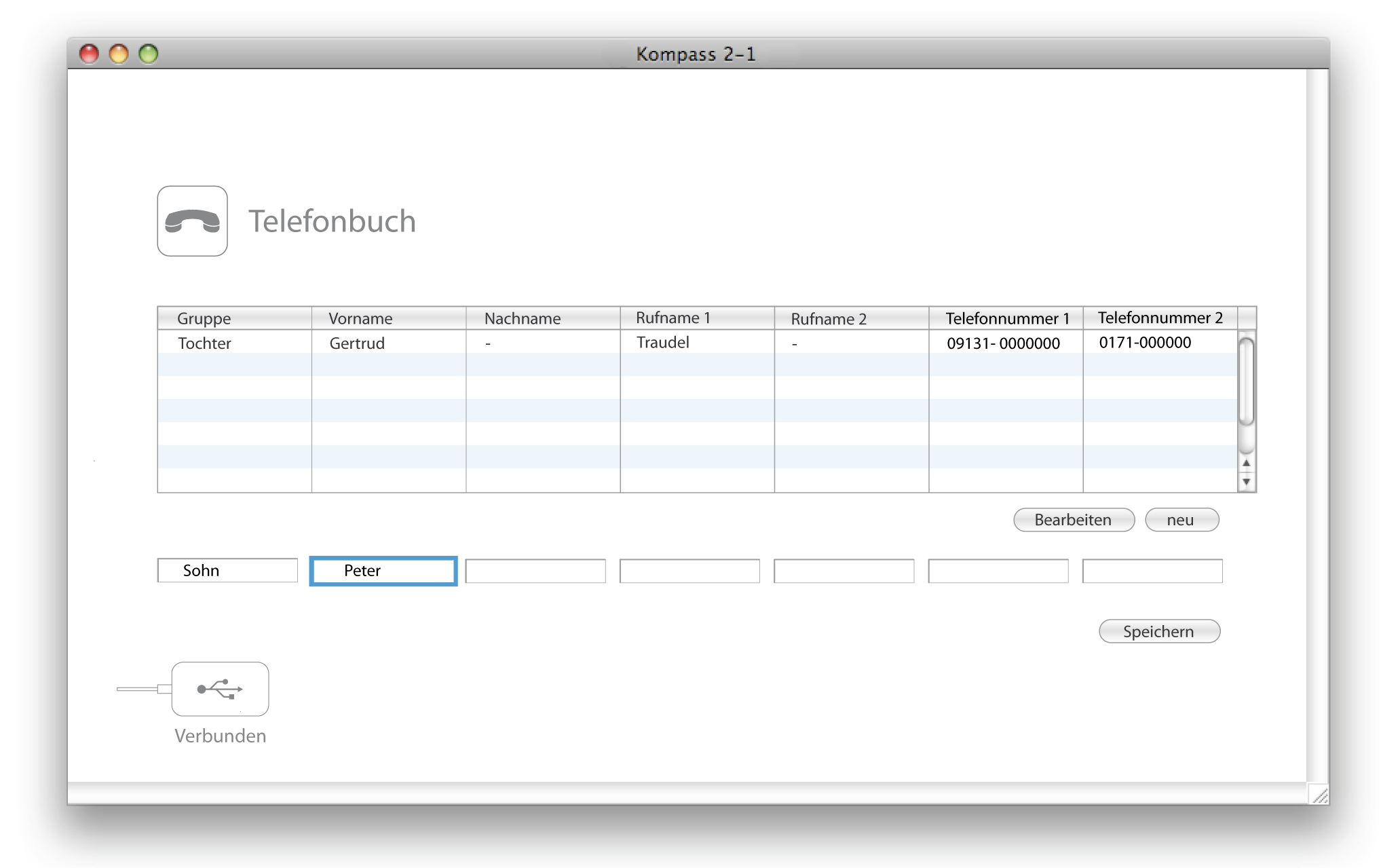
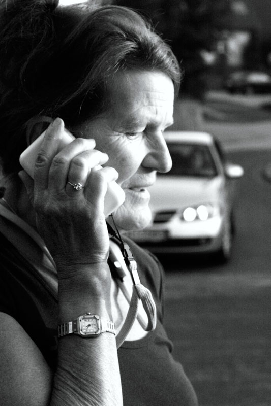
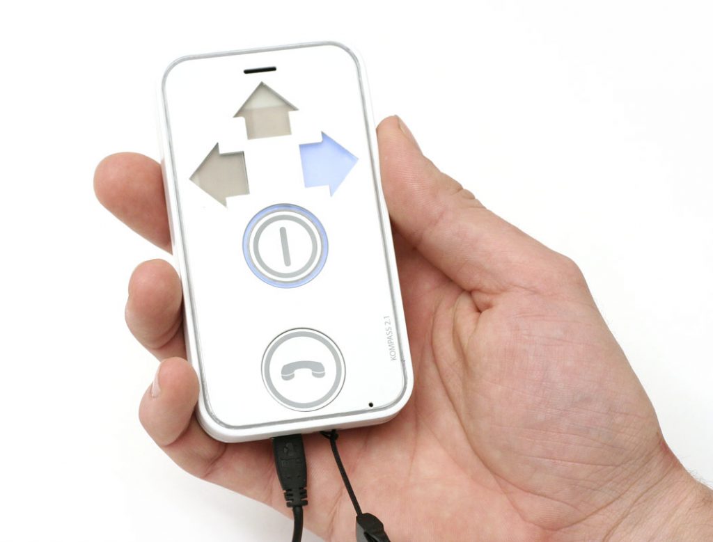
KOMPASS is a navigation help and communication device for people in early and medium stages of dementia. It uses an unorthodox and hyper-simplified interface with minimum amount of control elements. By using voice controlled communication with an intelligent dialog system, it does not need any kind of display.
Kompass offers dementia patients a longer autonomous and self determined life. Daily destinations, such as the supermarket, the pharmacy, or the doctor will be reached securely with the route directions adapted to the patients habits.
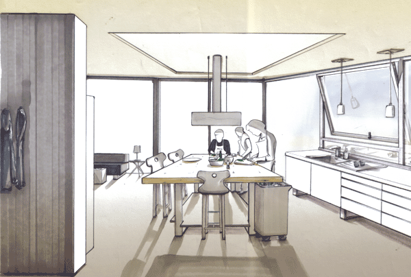
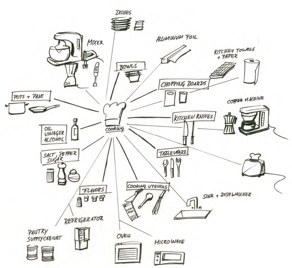
design process & research
Centro
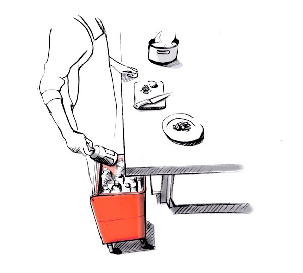
a communication platform disguised as wooden stove
Diplom work 2010

Thinking about what food and cooking actually mean – basic needs aside – I realized we are still stuck with the idea of the kitchen as a “functional” separated space. Going further on researching social habits led me to create a hub for people to gather, work, eat, play, communicate…and cook. Centro combines all these features and is open and flexible for whatever needs domestic life may bring. Going from theory into praxis, I built a functional model of Centro to prove it is possible to cook on wood. And everybody loved the food!
